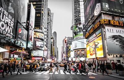
In a world overflowing with information, how do you make ad posters stand out in the crowd? Whether you’re promoting a new product, an upcoming event, or a special offer, the right design can captivate audiences and drive action.
The key lies in creating posters that not only draw the eye but also communicate a concise and impactful message. Dive into our comprehensive guide, packed with insights and strategies to help you craft compelling visuals that resonate with your target audience.
Let’s get started and unlock the secrets to designing posters that capture attention and command response!
Understand Your Audience
Before you start designing, know who your audience is. Are they young or old? What are their interests? Knowing your audience helps you make design choices that resonate with them.
Choose the Right Colors
Colors play a big role in design. Bright colors like red or yellow can grab attention. But make sure your colors match the mood of your message. For a calming ad, use blue or green.
Use Large Fonts for Important Text
Your message should be easy to read. Use large, bold fonts for important words or phrases. People need to understand your ad at a glance, even from a distance.
Keep It Simple
Less is more when it comes to poster design. Don’t overload your poster with too much information. Stick to one main idea. Use simple images and short text to convey your message quickly.
Include Eye-Catching Imagery
Images can speak louder than words. Use eye-catching posters, and creative poster designs, or use a high-quality photo or graphic that supports your message. Make sure the image is clear and not too busy.
Create a Focal Point
Guide the viewer’s eye to the most important part of your ad. This could be your product, logo, or message. Use contrast or positioning to create a focal point.
Add a Call to Action
What do you want the viewer to do after seeing your ad? Maybe visit a website, or store, or call a phone number. Make your call to action clear and prompt.
Test Your Design
Before finalizing your design, get feedback. Show it to a small group of people and ask for their opinions. Make sure your design is understandable and engaging.
Use Digital Tools
Many online tools can help you create posters. Programs like Canva or Adobe Spark offer templates and easy-to-use design tools. These can help if you’re new to graphic design.
Stay on Brand
Your poster should reflect your brand’s identity. Use your brand’s colors, fonts, and logo. Consistency helps people recognize your brand and builds trust.
Keep an Eye on Trends
Stay aware of current design trends, but don’t follow them blindly. Trends can make your ad feel modern, but always prioritize clarity and your message.
Consider Your Location
When advertising outdoor events, the location plays a crucial role in the design and placement of your posters. Outdoor advertising must account for changing weather conditions and varying light throughout the day. Choose materials and design features that withstand elements like rain, wind, or sun exposure.
Crafting Ad Posters That Leave a Lasting Impression
By following these steps, you can create ad posters that not only catch the eye but also communicate effectively. Design with your audience in mind, keep it simple and ensure your message is clear. Then, watch your posters draw attention and spark interest.
For more on this content, visit the rest of our blog!


